Phototheca is built with a variety of screen resolutions in mind. Users of Phototheca have a wide range of displays, from entry-level 1366×768 screens, through Microsoft Surface tablets, and up to professional ultra-high-definition (UHD), 4K-wide gamut displays. And Phototheca supports them all with maximum efficiency.
The basic interface of Phototheca is condensed and doesn’t waste screen space. It is comfortable to work with Phototheca even on 1366×768 screens. Things become more interesting and tricky with Microsoft Surface tablets or UHD 4K displays. Their resolutions are so high, and the pixels are so tiny, that Windows must scale up its interface to make the text and UI visible and comfortable for our eyes. This is what we call the DPI (dots per inch) property. Windows has this setting; it’s called “Text Size,” and has a scale from 100% up to 250% with 25% increments. You must be familiar with this setting if you have a high-resolution display. The sad thing is that not every Windows program or application is adapted for high DPI and, as a result, they may look horrible on these displays. Usually, when a program is not adapted for high DPI, everything looks super tiny or blurred.
This is where Phototheca stands out. Phototheca is tailored for high-DPI displays. Phototheca respects the “Text Size” setting of Windows and scales its own interface accordingly, without any blur or unwanted artifacts. Everything looks crisp and proportionally scaled.
On top of that, in addition to automatic UI scaling for high-DPI displays, Phototheca gives you manual control. It’s possible to adjust the size of several specific text elements: menu font size, Library panel size, and thumbnail titles size.
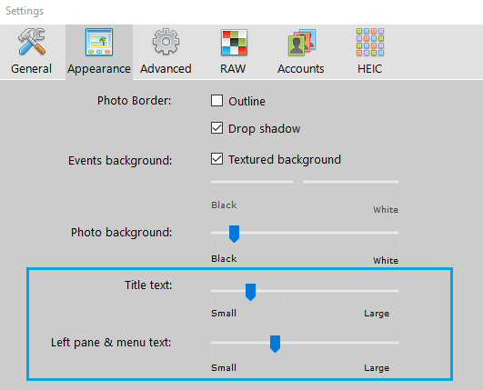
There are two sliders: “Title text” and “Left pane & menu text” on the Appearance page of the Settings dialog. With these sliders, you are able to adjust the size of titles, menus and the Library pane in addition to auto-scaling of the interface.